We are making some changes to the library homepage to improve the design and functionality of our website.
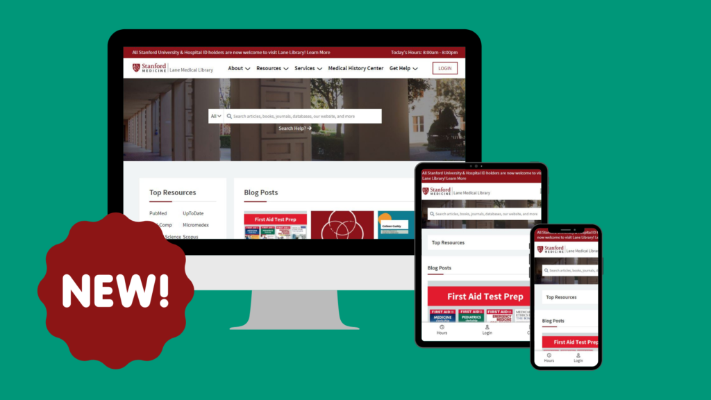
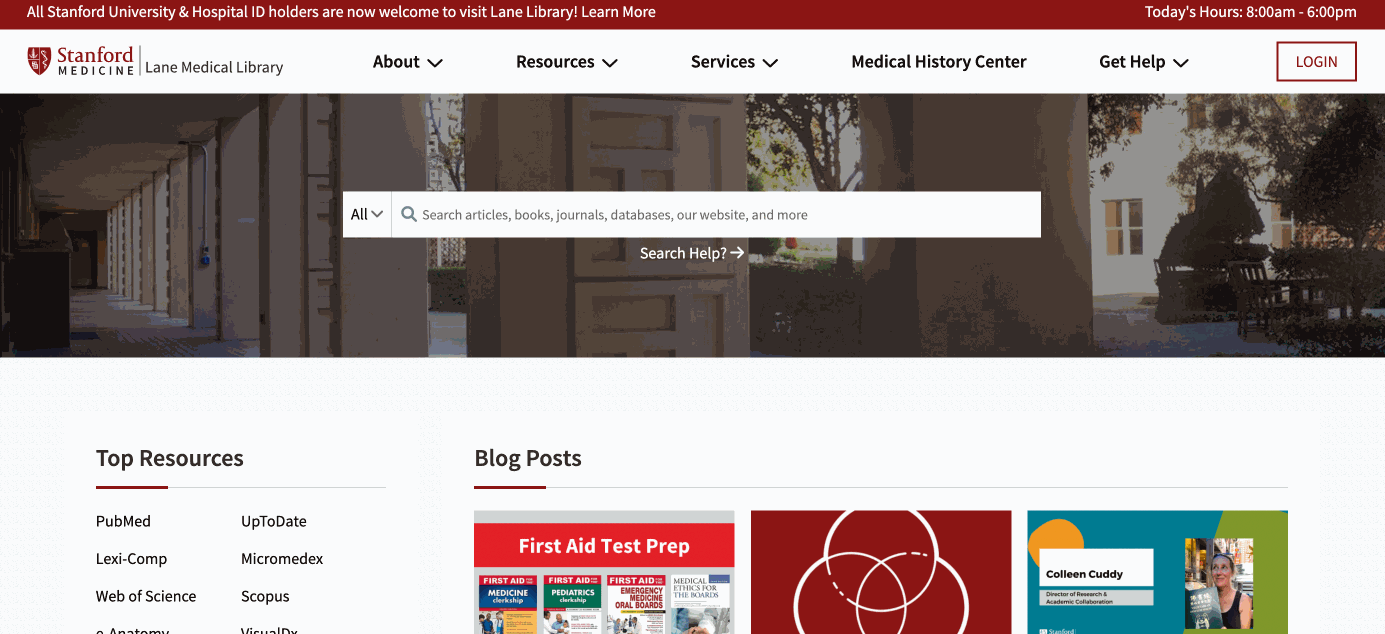
Our Website is Getting a Refresh
The new homepage includes an updated design, enhanced mobile responsiveness, and new content.
Here’s a Preview of the Changes:
Overview of Key Changes:
Improved Mobile Responsiveness
We designed the homepage for three screen sizes (desktop, tablet, and mobile phone). Try using the homepage on all your devices! On smaller screen sizes you’ll notice an optimized navigation menu and a sticky menu with our hours, login, and call options on the bottom of the screen.

New Content
We added some new content features to the homepage including an Explore section with quick links to resource pages, an email newsletter sign-up section, and a carousel of staff photos.
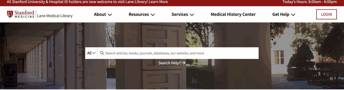
Navigation Menu
We updated our navigation menu to reduce the number of top-level options. We also added subcategories to some menu options to help you more quickly find the information you need. See a preview of the navigation menu below:
Share Your Feedback!
Do you have comments, thoughts, or questions to share about these changes? Let us know!